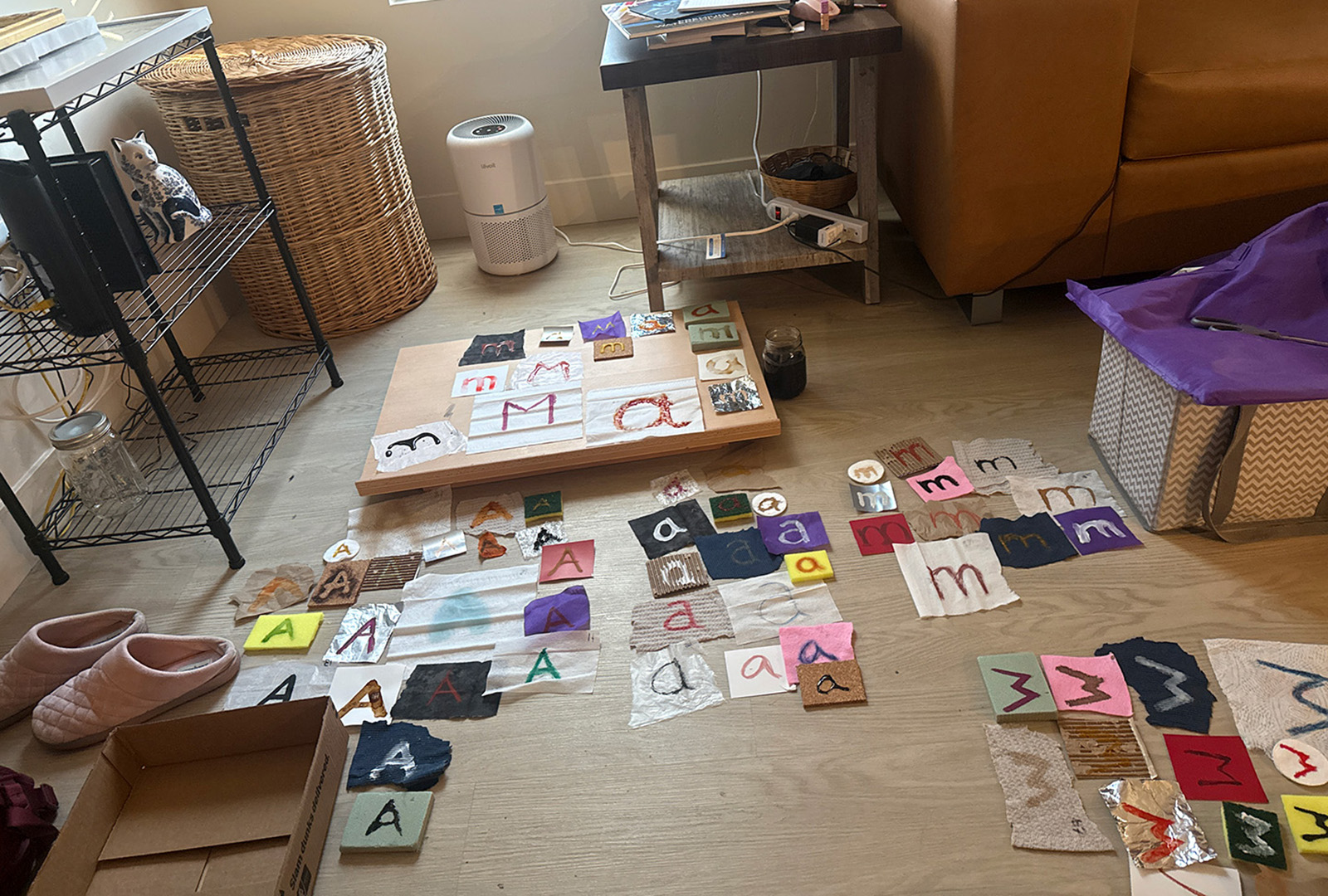
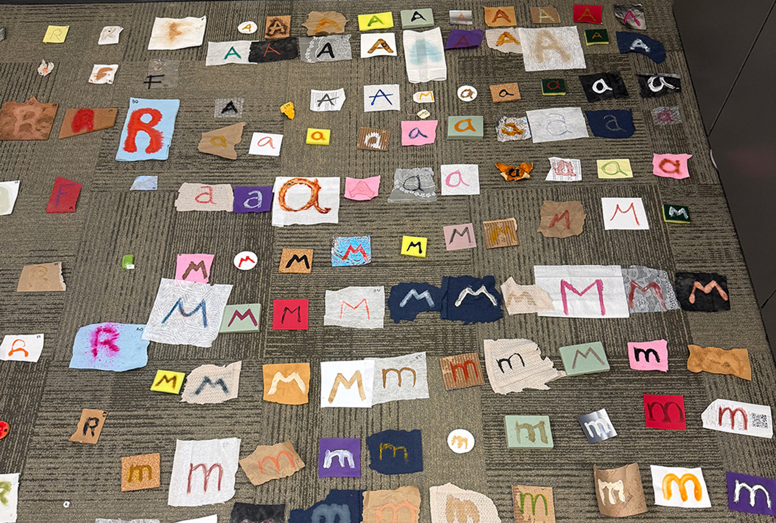
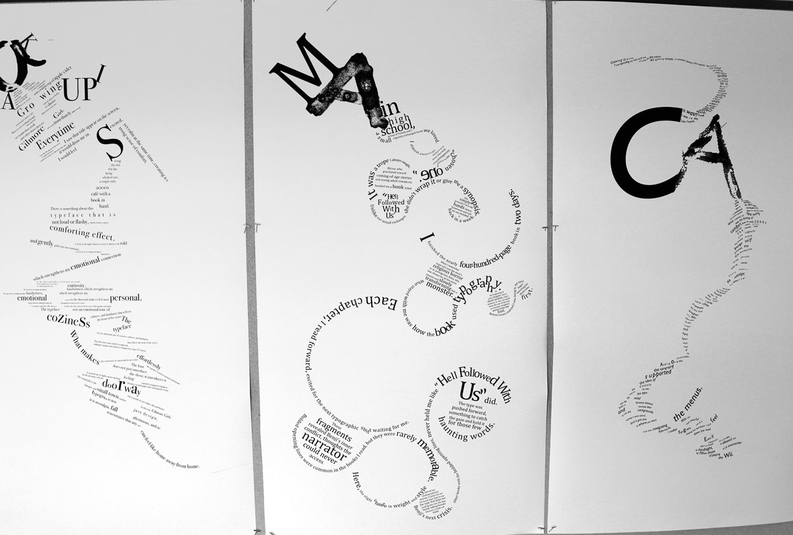
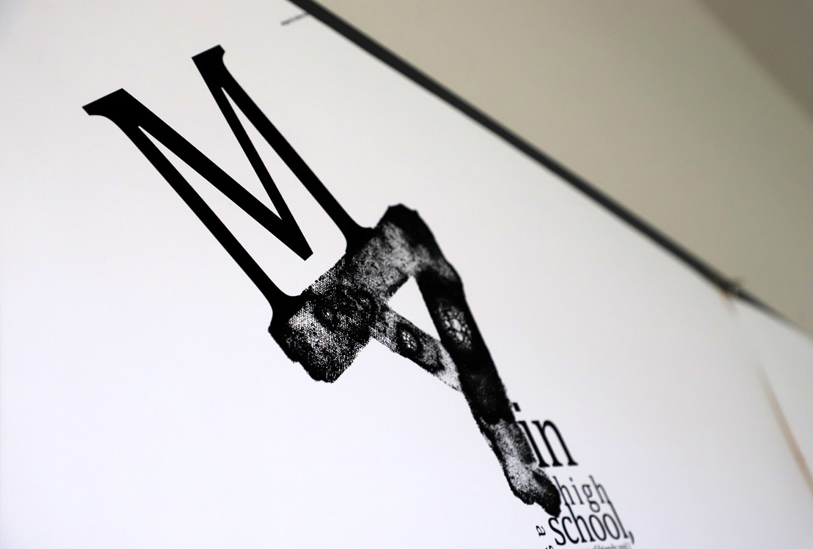
This project, titled Monogram, explored form and texture through the creation of 100 variations of the letters A and M using a wide range of materials to generate unique visual qualities. The strongest results were selected and scanned, then arranged through experimentation with scale, placement, and interaction to develop a cohesive monogram. This final mark was applied to a 22 × 44 inch poster, accompanied by abstractly arranged typography reflecting on a personal typographic experience—specifically, a book read in high school. The project emphasizes material exploration, composition, and the expressive potential of type beyond traditional structure.