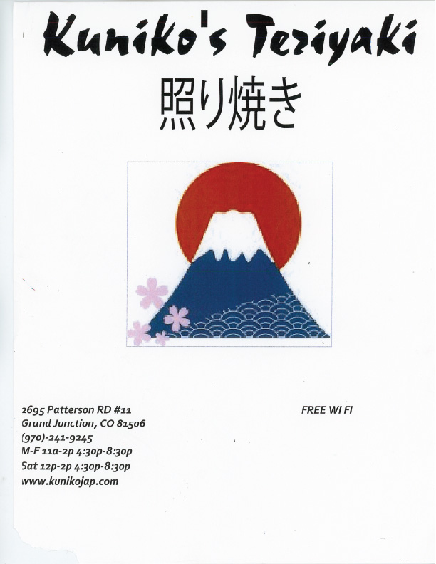
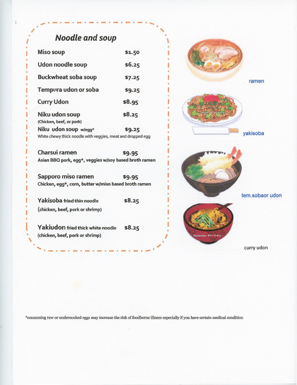
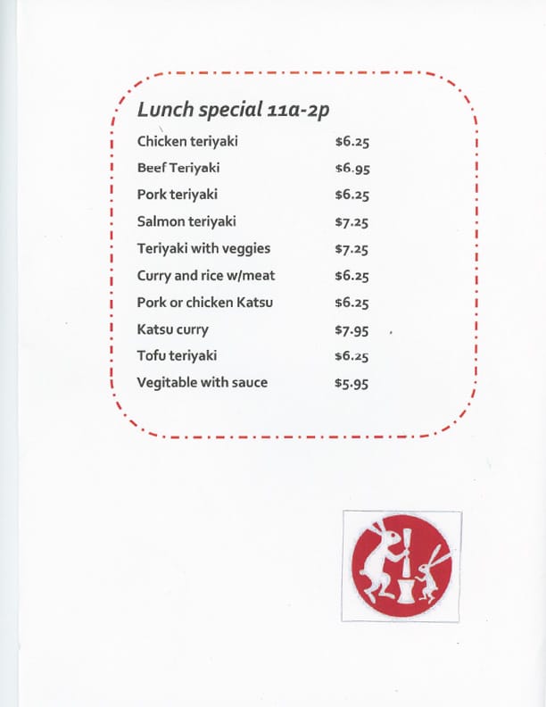
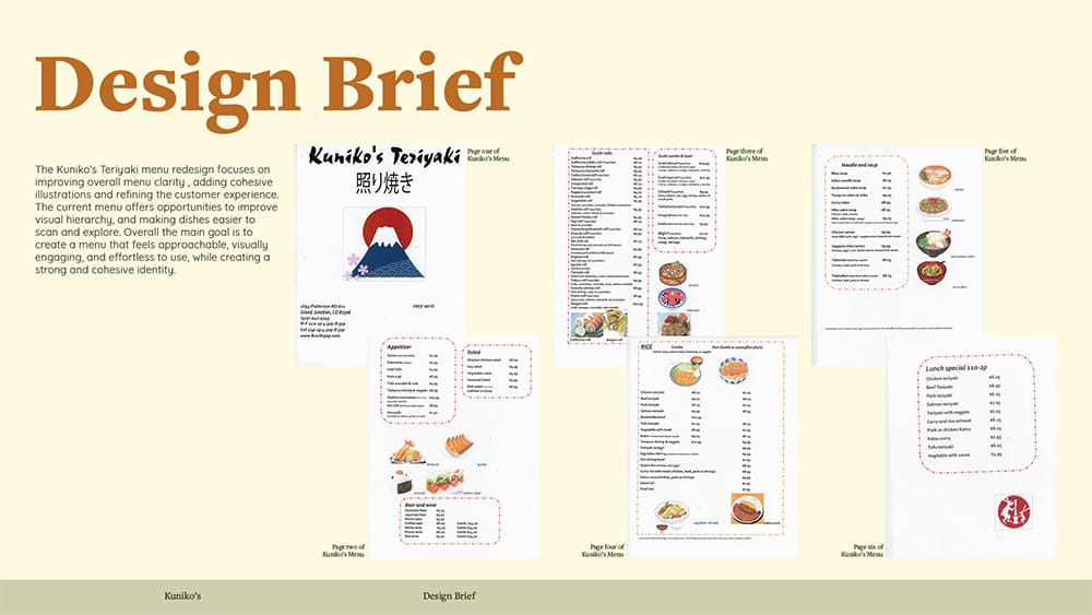
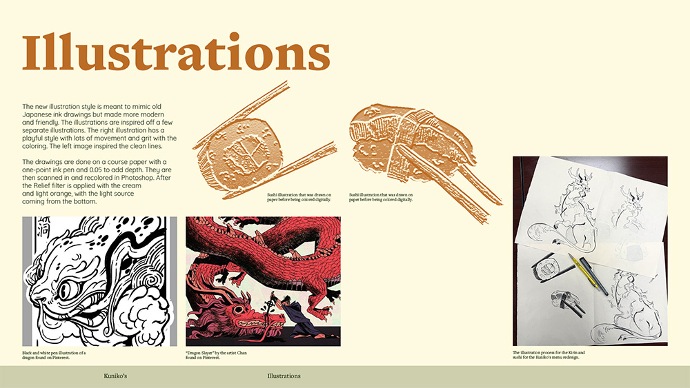
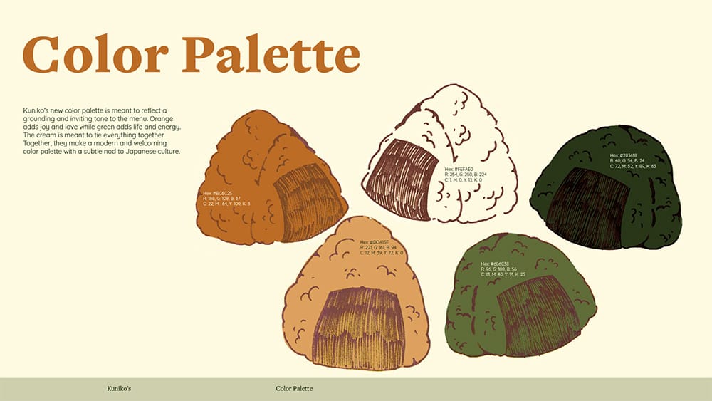
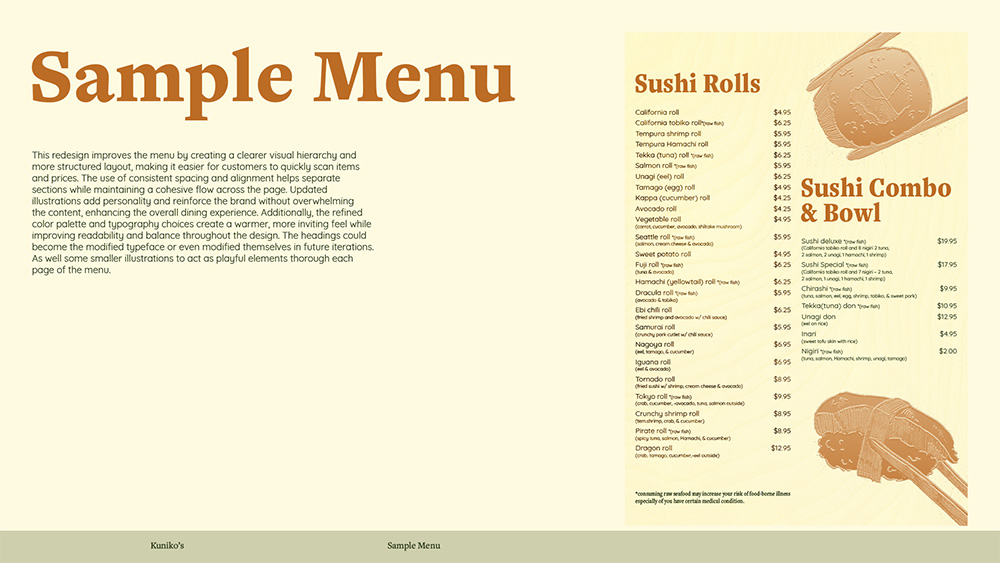
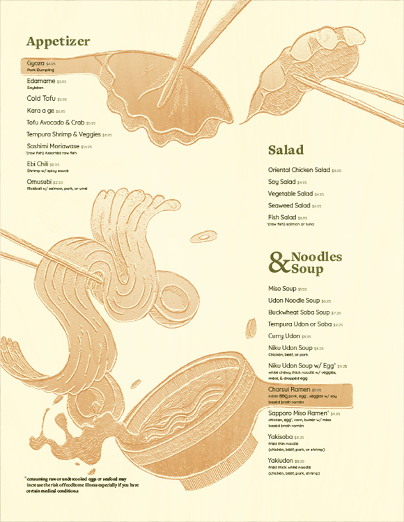
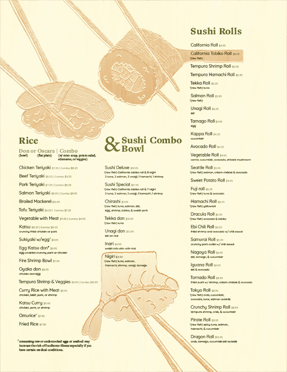
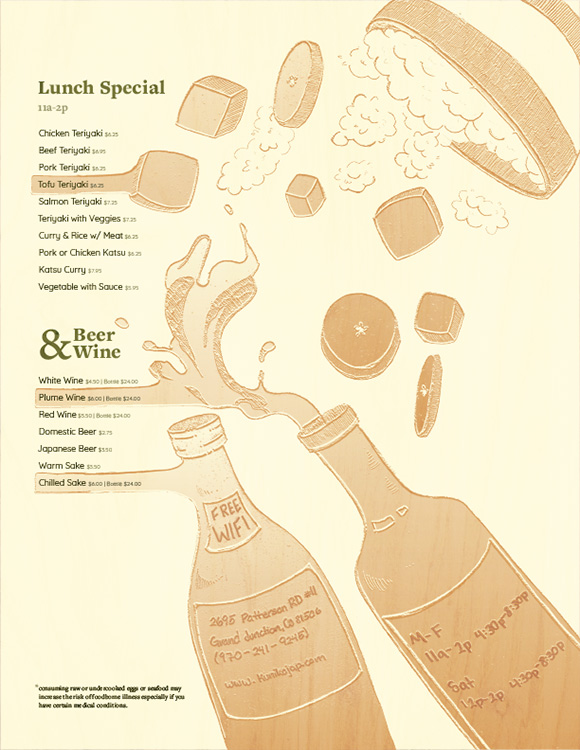
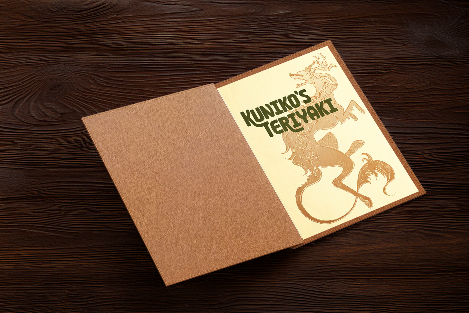
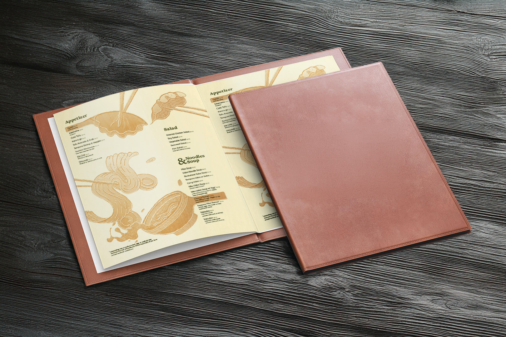
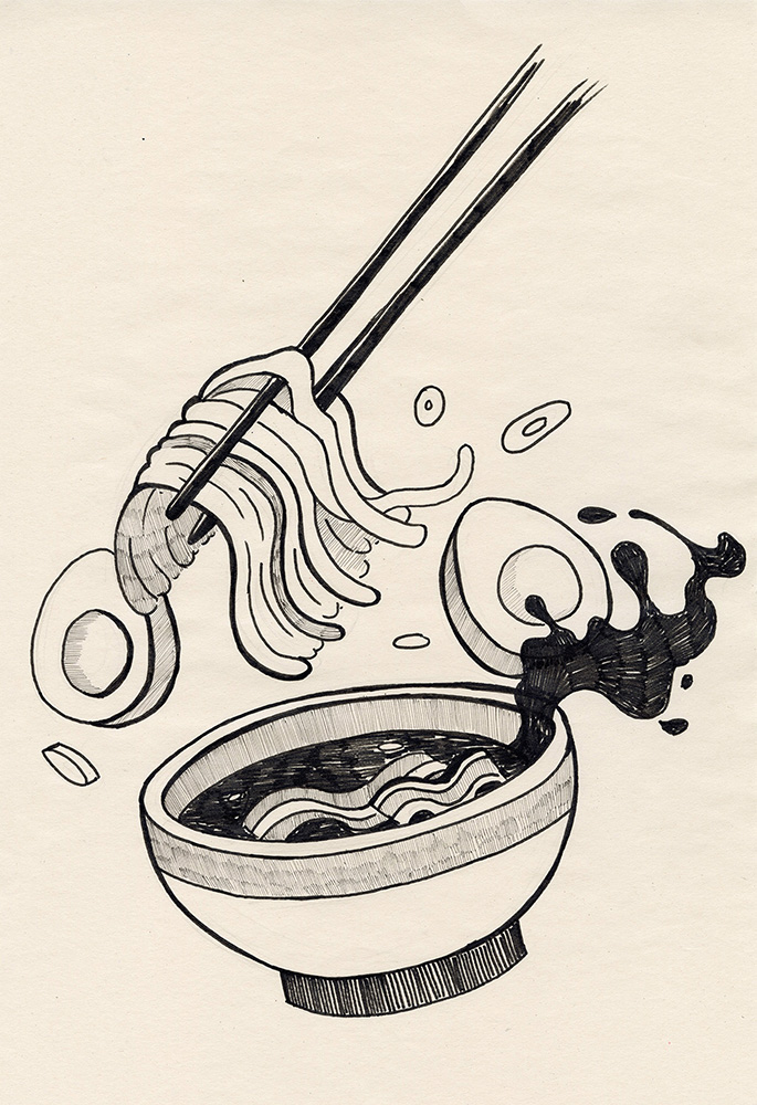
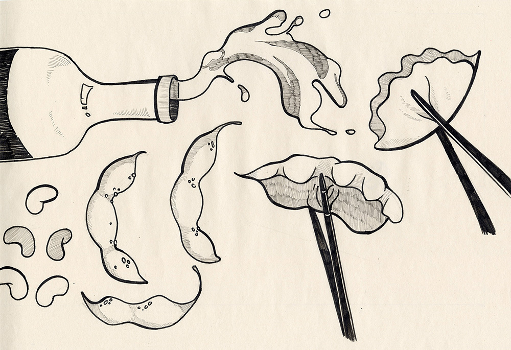
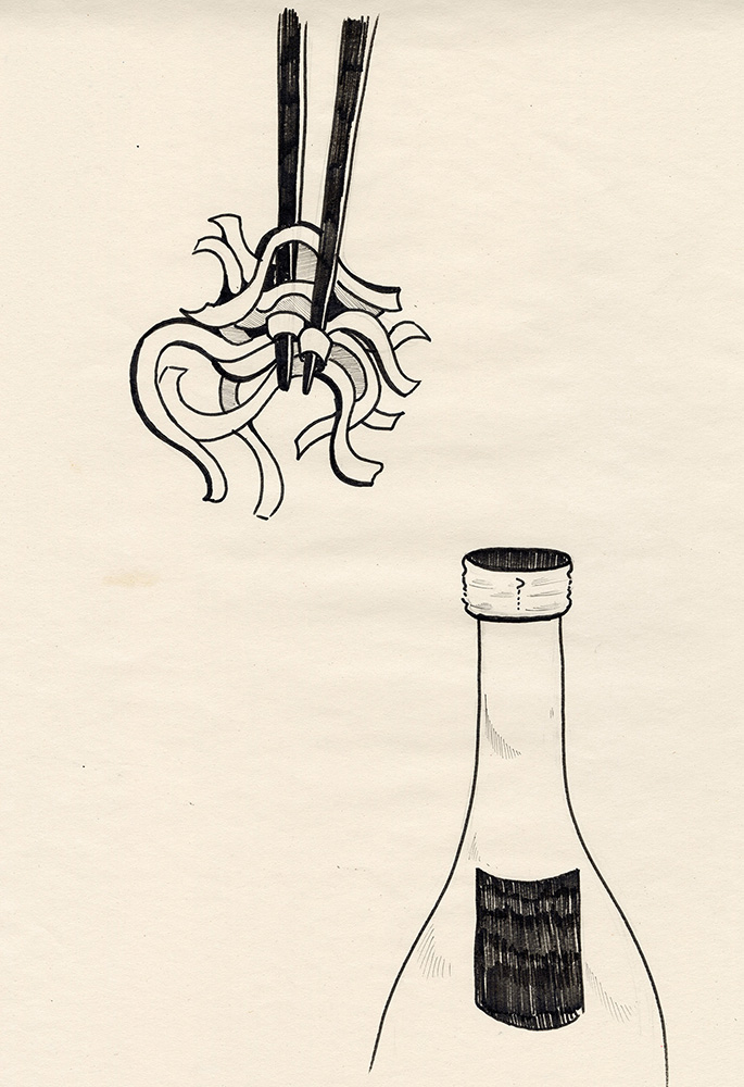
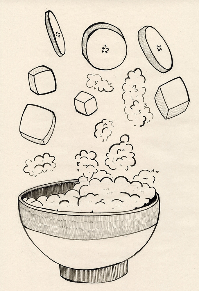
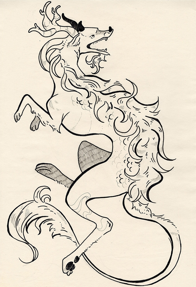
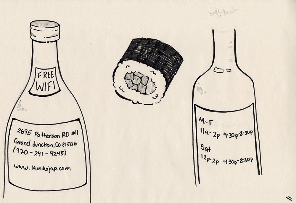
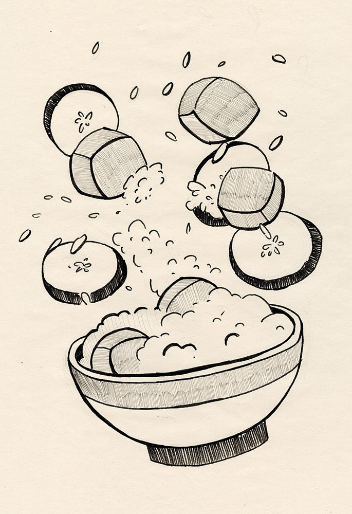
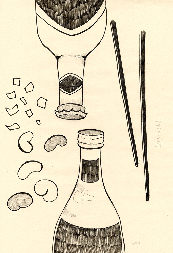
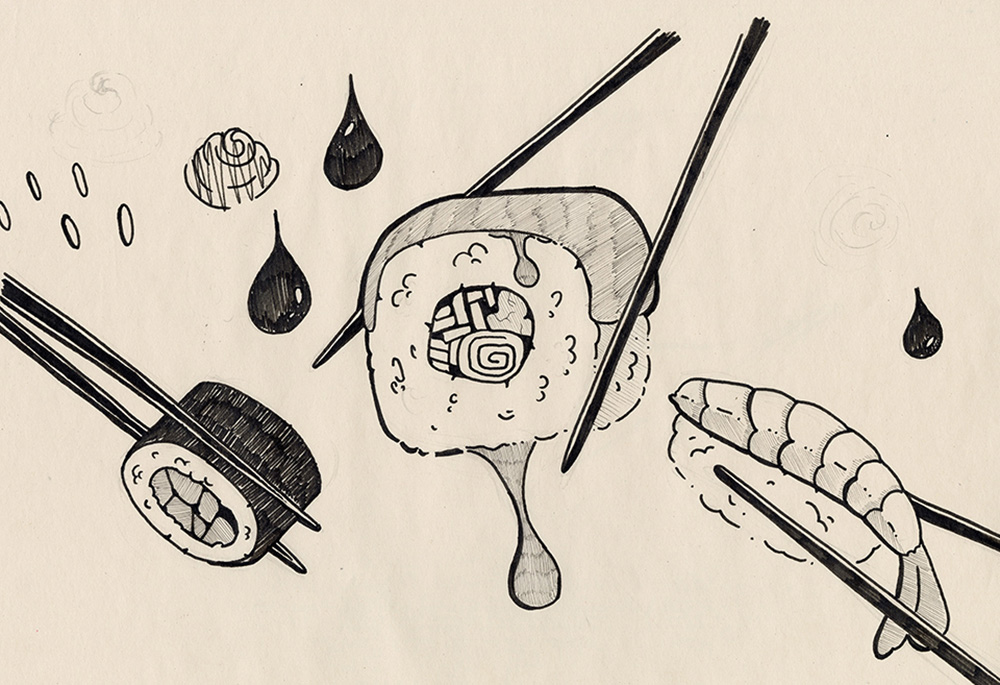
This project involved redesigning a local Japanese restaurant’s menu to address issues with inconsistent imagery, unclear hierarchy, and a confusing layout that made navigation difficult for customers. The solution introduced a more structured and intuitive design system, reorganizing menu sections to improve readability and guide the customer experience more naturally. A refined color palette of orange and green was applied to reflect cultural associations with warmth, energy, and growth, while new imagery featuring a Kirin was incorporated to symbolize prosperity and wisdom. Overall, the redesign created a more cohesive, visually balanced menu that improves usability while strengthening the restaurant’s cultural identity.


