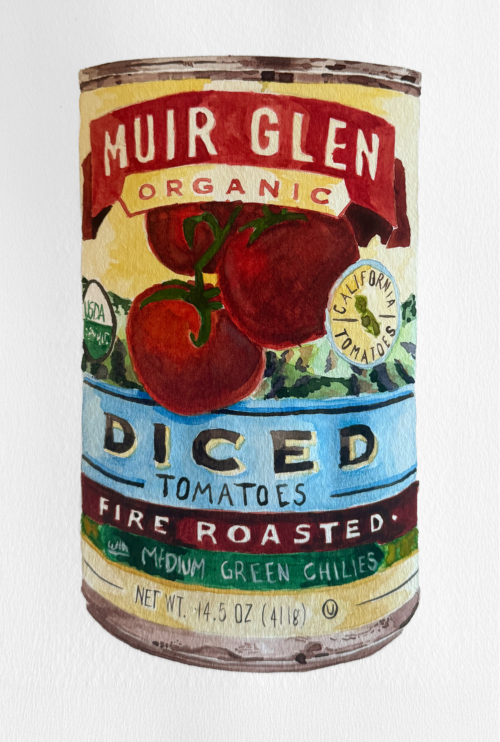
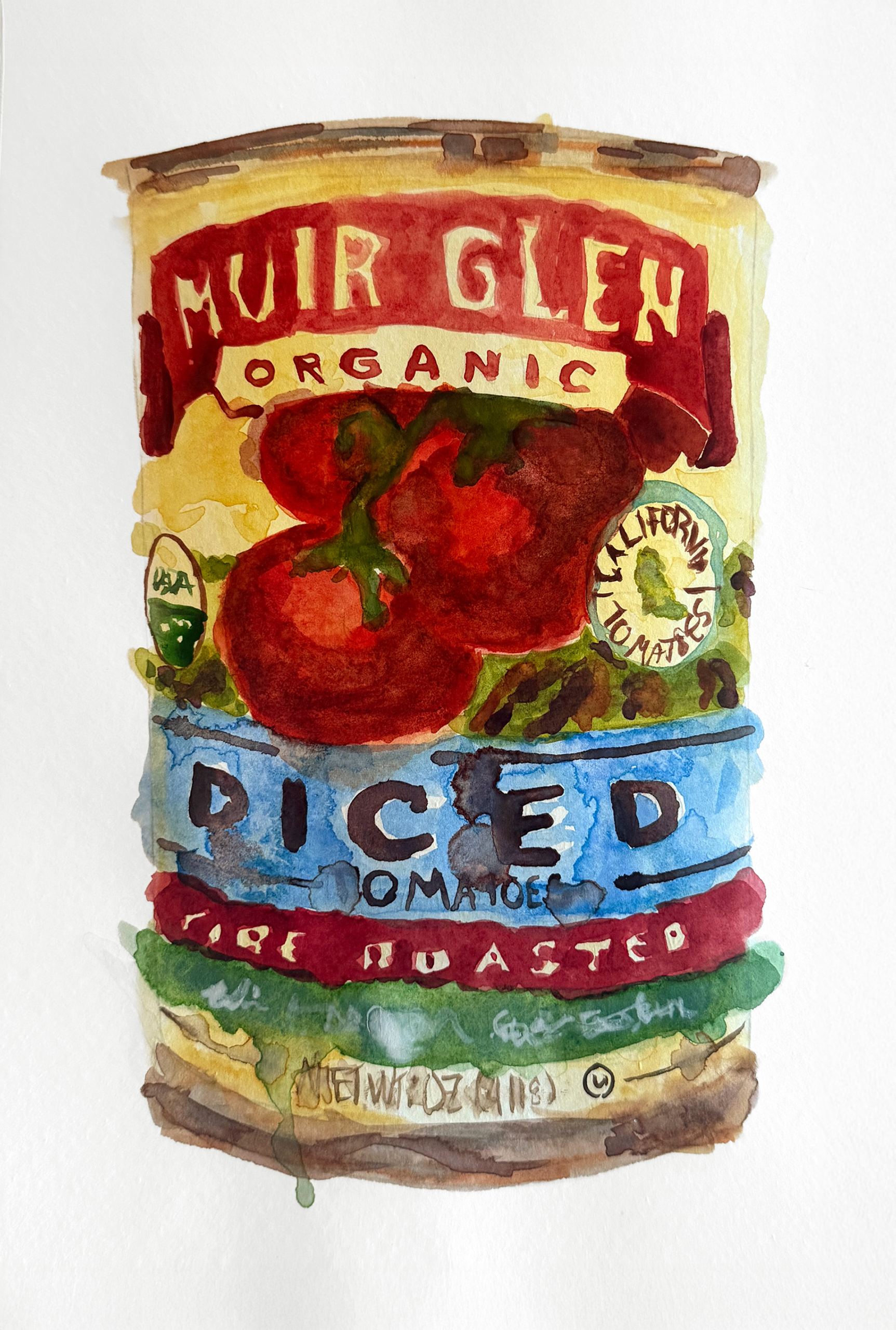
This project explored the role of illustration in product packaging and advertising through the creation of two painted interpretations of the same food item: a can of diced tomatoes. One version was rendered realistically to reflect traditional commercial packaging techniques focused on clarity and product recognition, while the second took a more abstract approach, emphasizing expressive color, form, and composition. By comparing the two styles, the project examined how illustration can influence branding, consumer perception, and visual communication.